
Branding is a huge part of what we do at adHOME, and it’s a big responsibility – defining a personality, differentiator and overall essence for a brand. It’s something we take seriously and approach with passion every time.
Each branding project we lead starts with diving in and understanding our clients on a deep level. We get down to the details, become an extension of their team and push boundaries to understand who they are. We took this approach with Five Oceans in order to learn about their influences and inspirations, and how they collaborate as a band. You can learn more about this part of the project in the last Brand Meeting blog post.
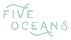
Feeling like Rock Stars by association, we got to work on brainstorming concepts for the new logo design. The team was full of ideas – inspired by the genuine nature that shines through their music and personalities. We presented 6 unique logo designs – each reflecting their brand personality and style. After some lively discussion, the band came to a unanimous decision on their new logo selection. Designed to reflect a mix of rustic country roots with a modern rock feel, the logo style landed somewhere in between both genres. The design consists of two key elements:
The Icon:
Inspired by their name and nature, the Five Oceans icon was created as a visual representation of the band. The image depicts the feeling of the ocean waves, combined with the band’s unique ability to bring forward each band member’s distinct style and sound.
![]()
The Typeface:
Inspired by their smooth sound and approachable personality, we wanted to create a typeface that evoked that same energy. The simplicity in the lines gives it a modern style, while the subtle texture and unassuming details of each character expresses their playful and creative sides.
The Wordmark:
Held together by two wave lines that tie everything together, the design connects back to the inspiration behind the icon.
This year marked a turning point for Five Oceans. Launching their musical careers through Start Your JRNY, going through a branding exercise to establish their new look and embarking on a new journey together has empowered them with more focus and drive than ever before.
We were inspired by the approach the band takes to everything they do – they’re a team through and through. Each with their own voice, sound and skill set but still open and committed to creative collaboration. After listening to the songs on their new EP for our inspiration for their new EP cover artwork, it was obvious that their sound reflected this new transformative journey.
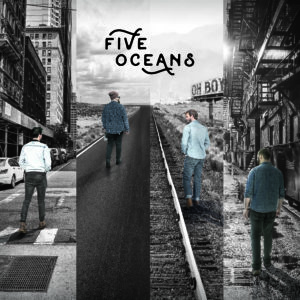
Each member is at a different place in their own journey, but ultimately, one that they will walk together. The background was split into different settings – a cobblestone road, railroad tracks in the countryside, a highway road, and a city streetscape – each unique but converging together to create a single path ahead. Subtle nods to the album name and new logo are found tucked away in the background completing the scene.
To complete the package, we created their Press Kit using visual elements from their new brand identity to bring the Five Oceans story to life. From their bios to gig history, discography, awards and accolades, the EPK provides the band with everything they need to show the world who they are and who they will become.