As consumers are spending more time online, and the digital landscape becomes more competitive, many brand’s find themselves looking for ways to stop people from scrolling and stand out from all the other messages. With the year 2020 underway, this summer, you may notice a number of trends in the look and design of brand content. adHOME has put together a list of the top 20 trends you can expect to see this summer,
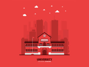
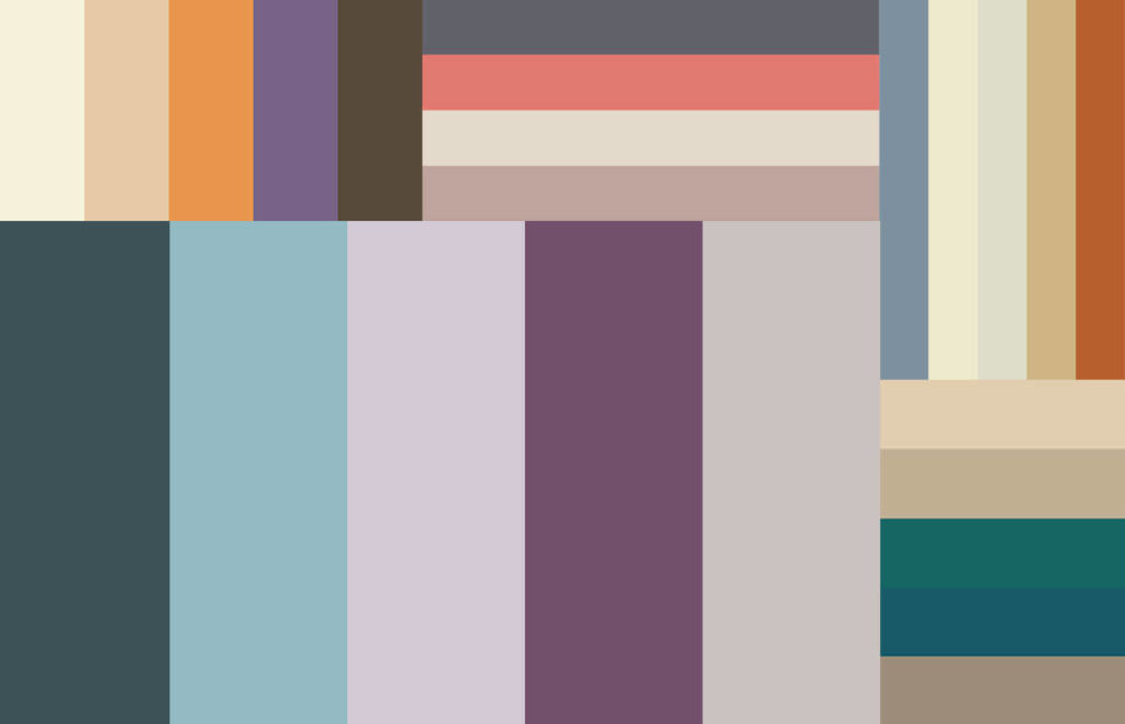
#1 – Muted Colours – adding a tint, tone or shade to make a colour less bright and more subdued
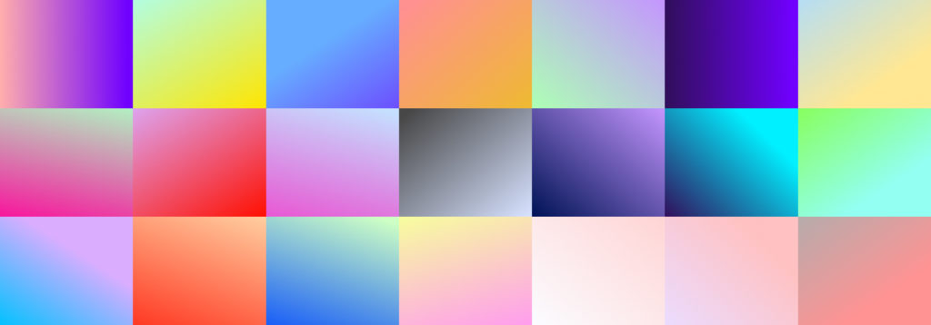
#2 – Colour Gradients – gradually transitioning from one hue to another
#3 – Abstract and Dreamy Illustrations – soft overlapping wiggly lines, organic shapes of colour, and natural elements
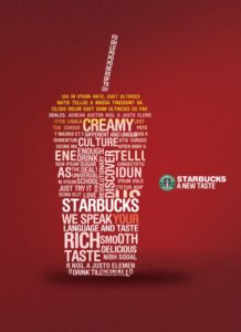
#4 – Artistic Typography – drawing shapes, semi transparency, maxi typography, multi line, heavy and simple fonts
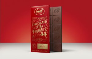
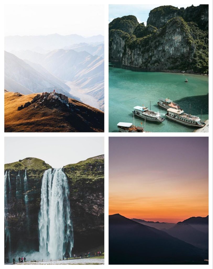
#5 – Neutral Stock Photos – photographs of landmarks, landscapes, portraits, etc. used on a royalty-free basis
#6 – Minimalist Landing Page – Make your call-to-action (CTA) as clear as possible, remove anything that distracts from the on-page experience
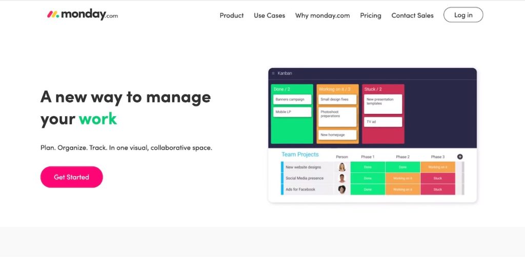
#7 – Branded Animations – dynamic, kinetic branding. Most commonly logos.
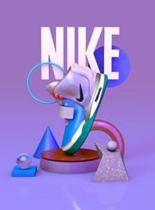
#8 – 3D Depth and Realism – Use of shadow and fine details to create a more life-like graphic
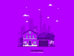
#9 – Monochrome – varying tones of only one colour
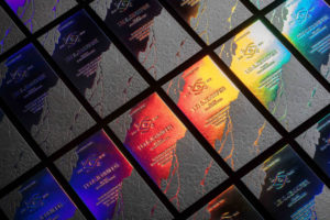
#10 – Shiny Metals – metallic, gold and silver are common but can be done on any colour
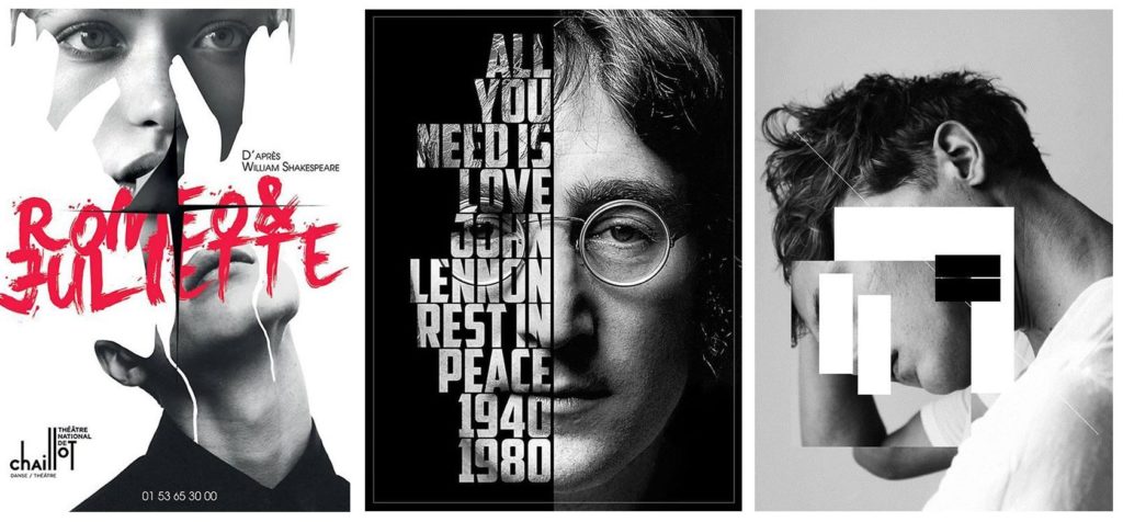
#11 – Image and Text Masking – hide some portions of an image and to reveal some portions, display images, gradients, patterns, and even videos inside the shape of a section of text
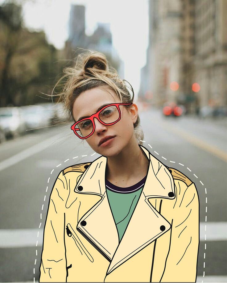
#12 – Line Art – usually single colour, little to no shading or solid areas, like drawn by a pen or pencil
#13 – Collage of Photos and Drawings – illustration replacing parts of a photo
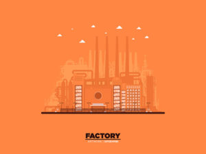
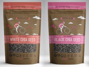
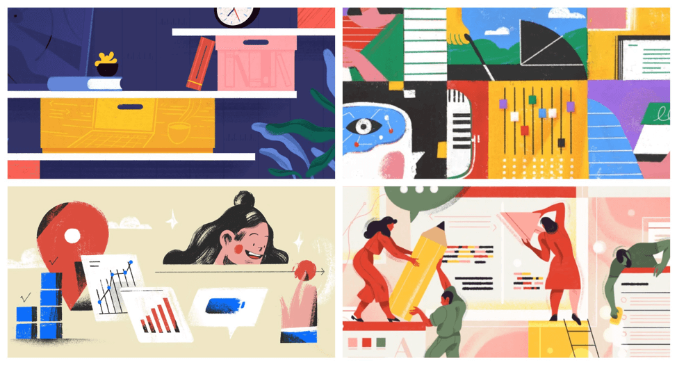
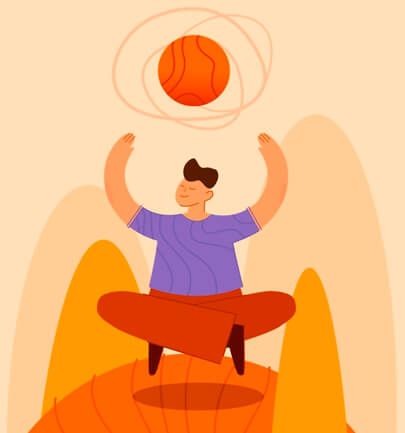
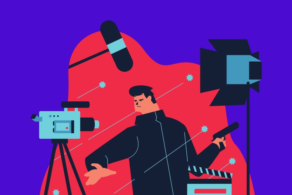
#14 – Simplified Illustrations – between line art and abstract illustrations, vibrant, basic and cartoon like
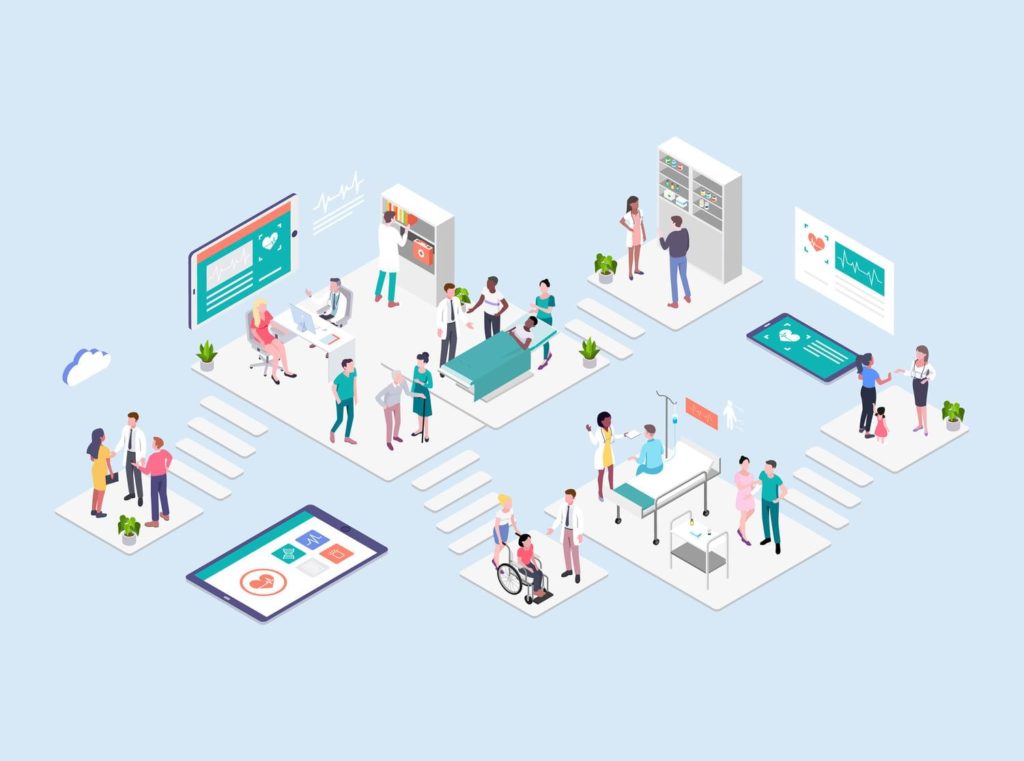
#15 – Isometric Illustration – “having equal measurement”, angles, turning 3D objects into 2D images
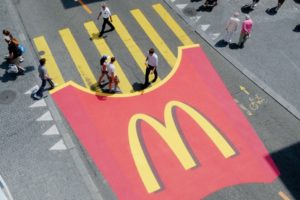
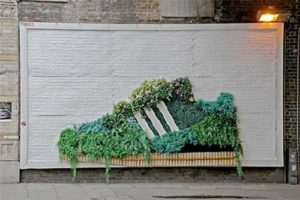
#16 – Street Art – graffiti, stencil art, loud attention grabbing art pieces displayed in public settings
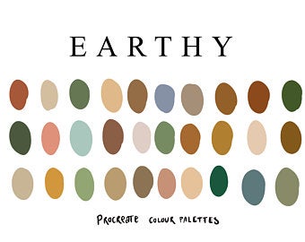
#17 – Earthy Colours – greens, browns, tans, teals, jewel tone colours
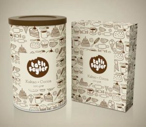
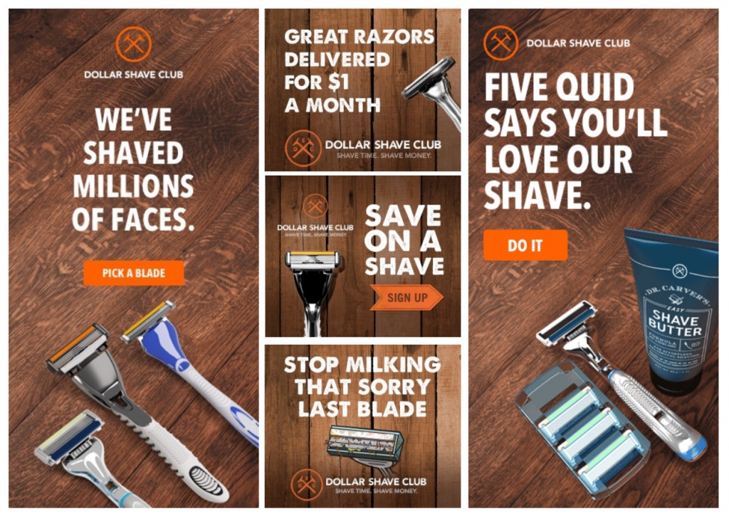
#18 – Pattern and Textures – various decorative elements, a visual element that repeats, graphic looks like it would feel
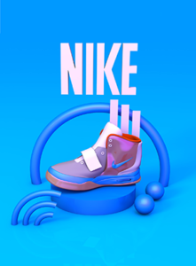
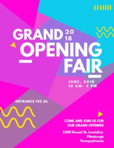
#19 – Geometrics Design – dominated by shapes, sharp lines, contrasting and complementary colours
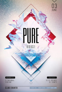
#20 – Liquids – fluid, free moving shapes simulating the look of splattering water or paint
Looking through these images, you are probably thinking to yourself that they really do look familiar. In fact, you might even find yourself feeling a sense of nostalgia from the vintage elements of all of these design trends. Over the past few years, design trends have been dominated by the popularization of 80s and 90s styles.
In Our Opinion
We asked our amazing creative team which of these design trends were their favourite to implement into client creatives. Here’s what they had to say!
Jess
I enjoy using a lot of these design trends so narrowing them down to a favourite few is tough. I really enjoy using:
-
- Colour gradients
- Abstract and dreamy illustrations
- Artistic typography
- Heavy, simple fonts, maxi typography
- Geometric design
Sarah
Drawing and art are my passions. So I really love when we can implement illustrations of any kind!
Nicole
I personally like to stay away from some trends, like popular colour schemes, as they tend to pass quickly. However, other design elements are more timeless – like the use of hand-drawn illustrations to show craft, personality and/or a handmade feel.
The use of expressive typography and flat design for the web have also had a good long time in the spotlight. I think branded animation is something that will continue to grow with the advent and increase of the possibilities of video and animation on various platforms. It’s a unique new way for brands to communicate indeed of a static logo.
As for what I personally enjoy, there are a few.
-
- Artistic Typography: I think there will always be a place for expressive type – especially hand-drawn, experimental or found – it shows craft and personality
- College of Photo and Drawing: There are many forms of this, but I think it is interesting to see the interplay of the real and the imagination. It can be very effective in explaining complicated ideas and showing dreams/whimsy etc. It also visually provides a lovely juxtaposition
- Earthy Colours: I’m more drawn to rich jewel tones and earthy tones so I’m more than happy to see these kinds of colour pallets. As Sarah said, colour very much depends on the project and the brand – colour is a huge part of creating the experience, crafting the mood of how we want users to feel while interacting with our work.
Wrap Up
While design preferences are subjective, there is an overwhelming acceptance that these twenty trends are set to dominate the graphic design industry in summer of 2020. From unique and timeless illustration to dynamic eye-grabbing animation and colour, we are sure to see some stunning campaigns and packaging this year.
What are your favourite design trends from our list? Let us know in the comments below!
