
Inspired by the Greek Muse who ruled over the arts and sciences and offered inspiration in those subjects, the MUSE Creative Awards is an international competition that honours creative professionals who inspire others to greater heights, becoming a MUSE via their concepts, ideas and designs.
This year, adHOME is proud to have inspired so many and taken home 6 new MUSE Creative Awards for the work we’ve collaborated on with our amazing clients.
Platinum
Cassels – Integrated Brand Campaign
Category: Integrated Marketing – Company Branding
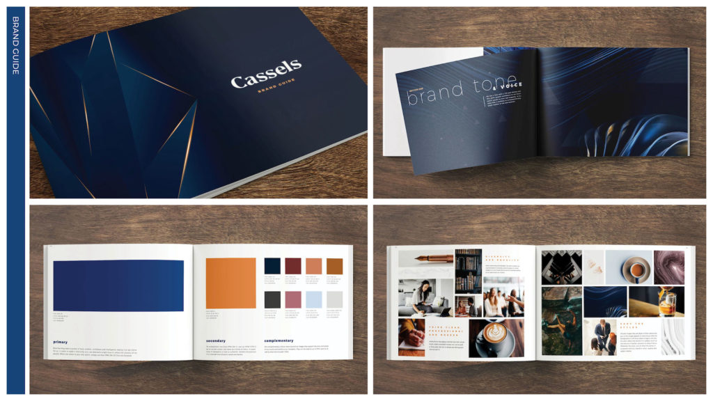
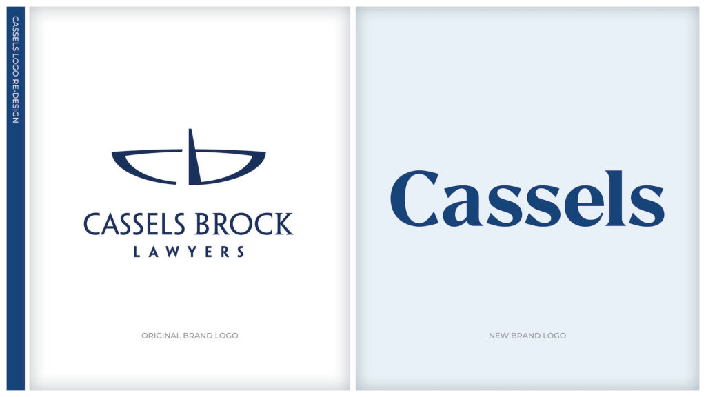
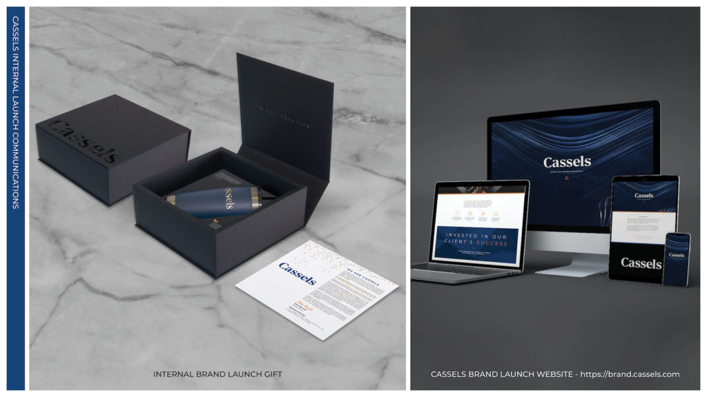
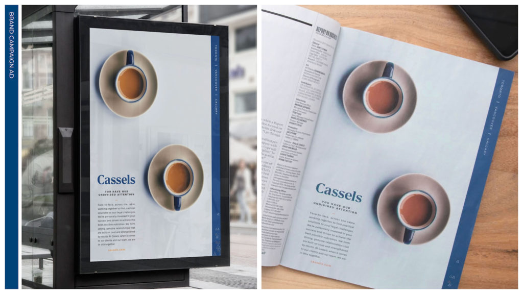
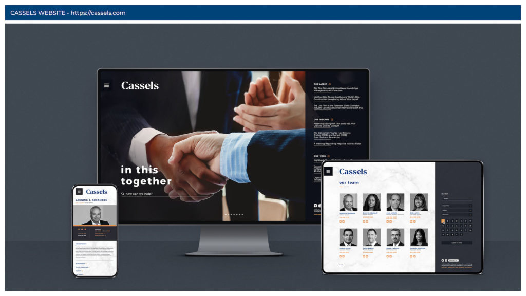
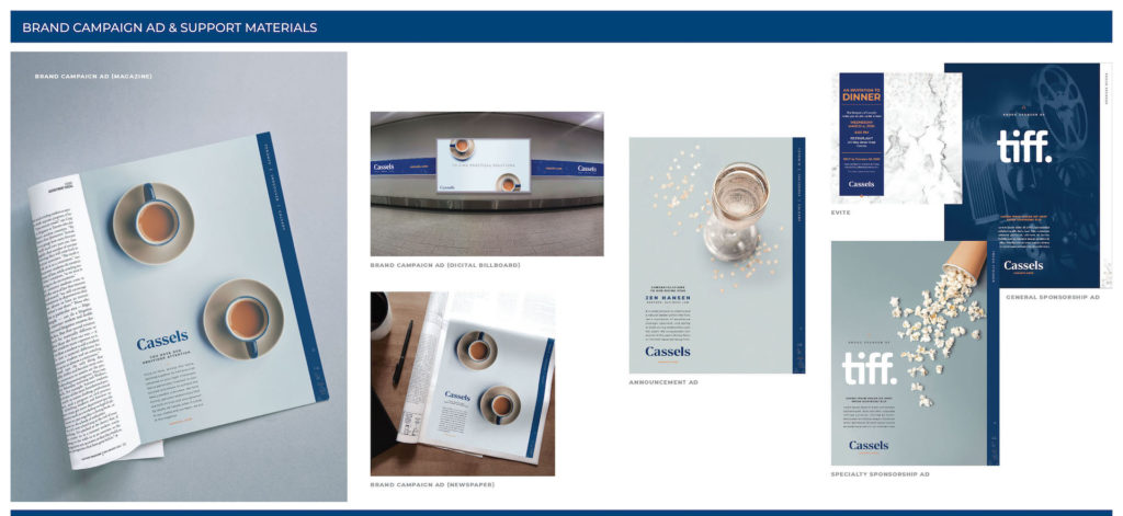
Cassels Brock is one of the largest corporate law firms in Canada and prides itself on its ability to stay on the leading edge of trends in law and business. The leadership team at Cassels Brock recognized that their brand was failing to keep up with the organization’s evolution and that they were facing a disconnect between their current branding and marketing, and the firm’s current culture and positioning.
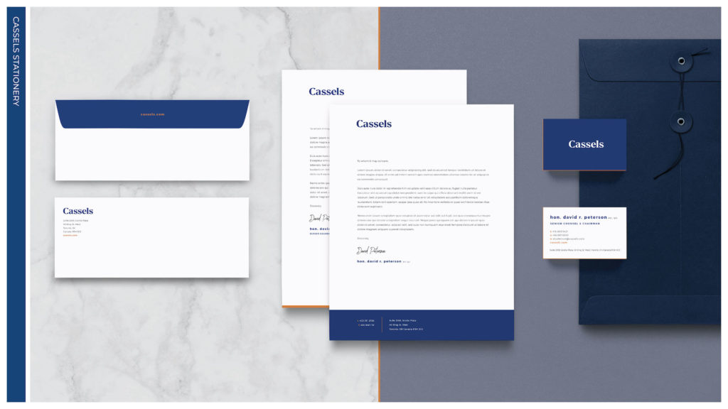
The rebranding of Cassels began with a Brand Blueprint process that delivered an accurate and precise understanding of the firm’s brand goals and desired positioning. This immersive branding approach established an understanding of who Cassels is, its personality traits, what it stands for and its target audience. The evolution of the firm’s name was just one part of a bold rebranding campaign that began to position them as a progressive law firm; in addition, their new corporate identity, website, and marketing materials centre around their commitment to an enhanced client experience.
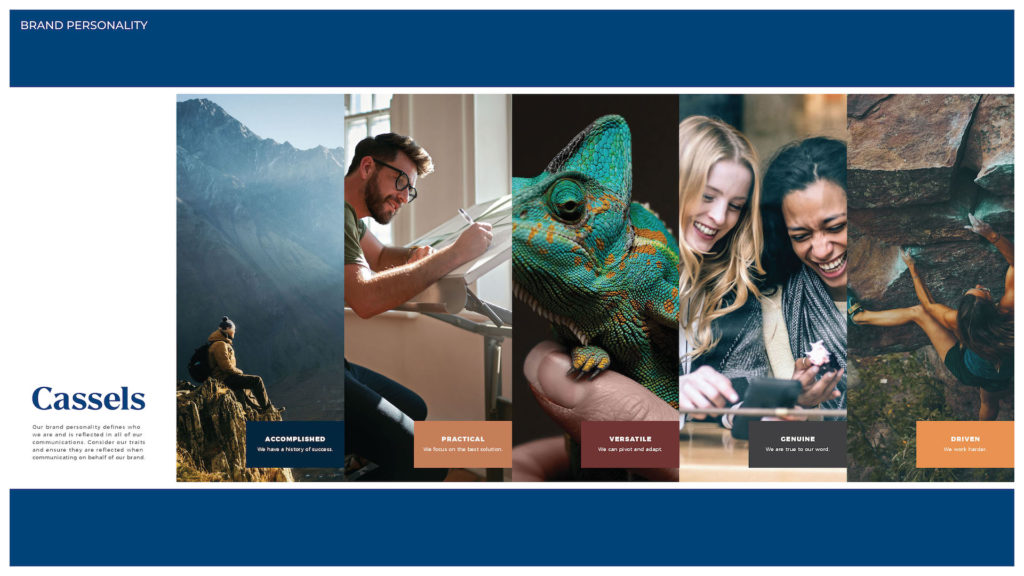
Design and messaging portray Cassels lawyers as approachable, adept, and dynamic. Key traits–such as driven and versatile–are baked into the new brand’s personality that helps bring the brand to life and allows Cassels to firmly position itself as an accomplished industry leader with an entrepreneurial spirit.
adHOME Creative – Website Design
Category: Website – Self Promotion

The overall tone of the website is a juxtaposition between professional and playful, contrasting the high calibre of our work with our creative vibe and culture. This tone was achieved in a number of unique ways. First by pairing quality imagery with custom ‘doodles’ and notes developed in a handwritten style. These hand-drawn illustrations lend an air of personality that communicates directly with the visitor. These elements also interact with the photography to create a more immersive experience developed through the use of layering full screen and cropped images, parallax and animated iconography. We showcased our brand colours throughout, using teal and lime green as a cohesive palette to create a unified feel across the site.
One of the most heavily trafficked areas and important sections of our site is our work showcase. As well as the deep dives illustrated by our case studies, we created sector-specific videos that feature projects in each specialized industry. Our team page celebrates the unique character of each member. Since our family-oriented approach is a cornerstone of our culture, we created personalized “doodle” portraits for all staff.
Throughout the site, we display vibrant agency photos to give future employees and clients a taste of the environment and playful surroundings they can expect to enjoy. Our Vibe section serves to highlight our social presence and our community-minded spirit. Overall, our goal was to share our story while taking the viewer on a lighthearted adventure that will make them want to keep exploring and learning.
Gold
Camerise – Brand Identity
Category: Corporate Identity – Brand Identity
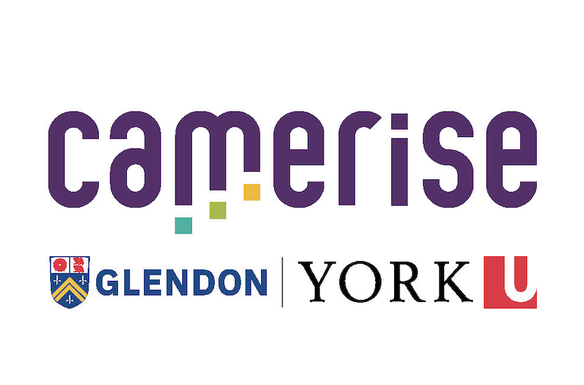
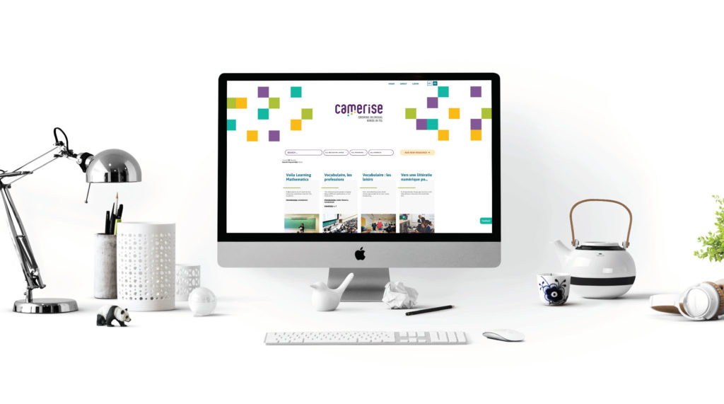
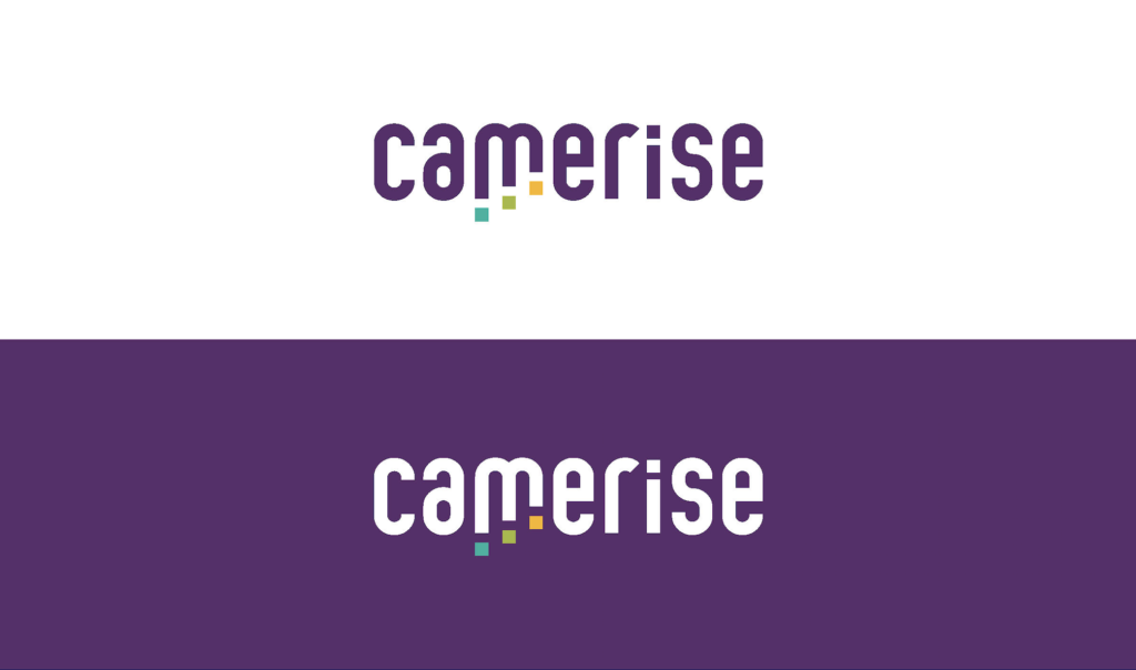
Camerise is a user-friendly digital platform designed to bring together students, educators, administrators and parents to facilitate access to FSL (French as a second language) programs across the country. The goal is to address systemic challenges together and find solutions in order to sustain Canadian bilingualism. The rich purple Camerise berry is emblematic of adapting and thriving in new conditions invoking feelings of inclusivity and evolutivity.
In developing the Camerise brand, we wanted to highlight the professional and progressive nature of the program. The use of a lowercase font as the base for our development of the wordmark helps to lend a youthful appearance, while the bold nature of its sans serif structure adds a component of strength, authority, and credibility necessary for an academic organization. The customized letterforms are rounded, giving the wordmark a welcoming and approachable tone while allowing Camerise to have strong ownership over its brand.
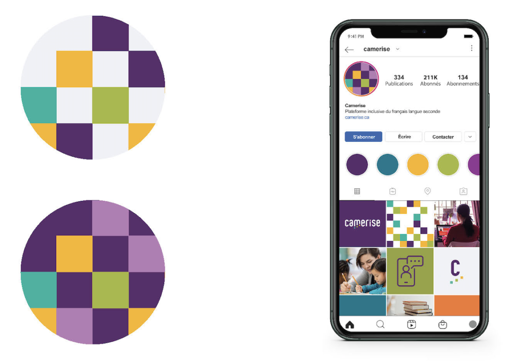
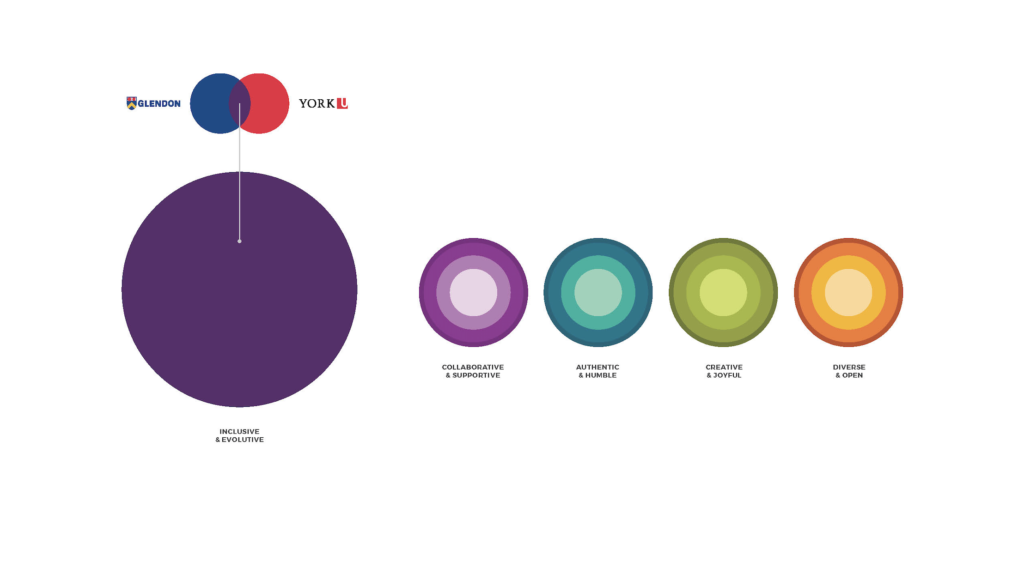
Our primary purple colour was influenced both by the Camerise berry, for which the program is named, but also the mixing of the primary colours in the York University and Glendon brands. The red and blue mix to create a rich purple. Our secondary colour palette makes use of vibrant, but natural complementary colours that represent other traits important to the brand. Light purple represents collaboration and support, while teal reflects an authentic and humble nature. Green showcases creativity and joy, while orange represents diversity and openness.
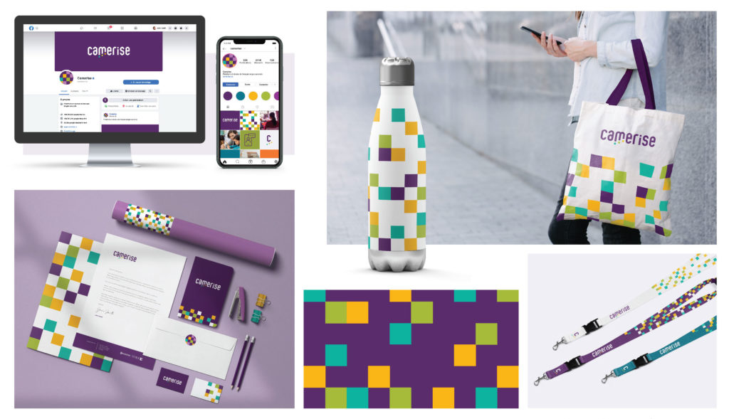
The square iconography used in the logo depicts steps moving upward, representing forward momentum and the journey through elevating one’s knowledge as they grow and evolve. This progression gives an uplifting feeling, showing broadly what education provides in someone’s life. More specifically what Camerise strives to do – uplift people through the sharing of educational resources. The pattern blocks are randomized in other branded materials to tell the story that learning is not a linear process, but a journey that can be different for each individual. This pattern tells their story across all of Camerise’s branded collateral, bringing continuity and cohesiveness to every element.
Maple Leaf Foodservice – Food 5 Ways Sell Sheets
Category: Marketing & Promotional – Flyer

Menu planning for senior living and healthcare facilities can be a real challenge. Patients each have their own unique dietary needs, and Registered Dieticians are responsible for planning healthy, appetizing, and versatile menu solutions year after year. That process can be quite daunting, particularly during a pandemic when resources are low and time is more precious than ever.
The Healthcare & Senior Living division of Maple Leaf recognized this challenge among their customers and saw an opportunity to use their long-standing Foodservice and nutritional knowledge to support their customers through innovation. Food 5 Ways was created to showcase the versatility of their product offerings. This new seasonal go-to guide for menu planning has had an incredible response among customers – garnering engagement and loyalty right from the first edition.
Food 5 Ways is distinct in the Healthcare & Senior Living world, in its approach to showcasing 12 of Maple Leaf’s most versatile and nutrient-dense products fitting each of the two core seasons. The brochure delivers 5 seasonal recipes per product, giving readers the potential to cover their menu planning needs for a full season! And also provides an appetizing, innovative, and practical solution to menu planning that addresses the challenges that customers have experienced for years. Developed biannually, with a Fall/Winter version and Spring/Summer version – each brochure showcases new recipe ideas to keep menus fresh and nutrition-forward.
Food 5 Ways takes all of the guesswork out of menu planning, maximizing on versatility and simplification for their customers as each page of the brochure contains its own set of nutritional breakdowns, product details, and cooking methods.
Silver
Ontario One Call “Get the Dirt” Campaign
Category: Integrated Marketing Campaign
Different exotic plants in pots on a stand in a botanical garden.. 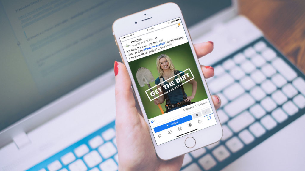
Ontario One Call is a public safety not-for-profit organization that acts as a communications link between utility companies, underground infrastructure owners, and individuals who are planning to dig in the province of Ontario.
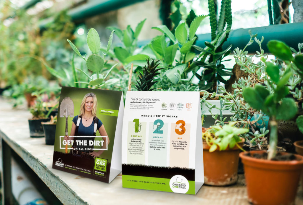
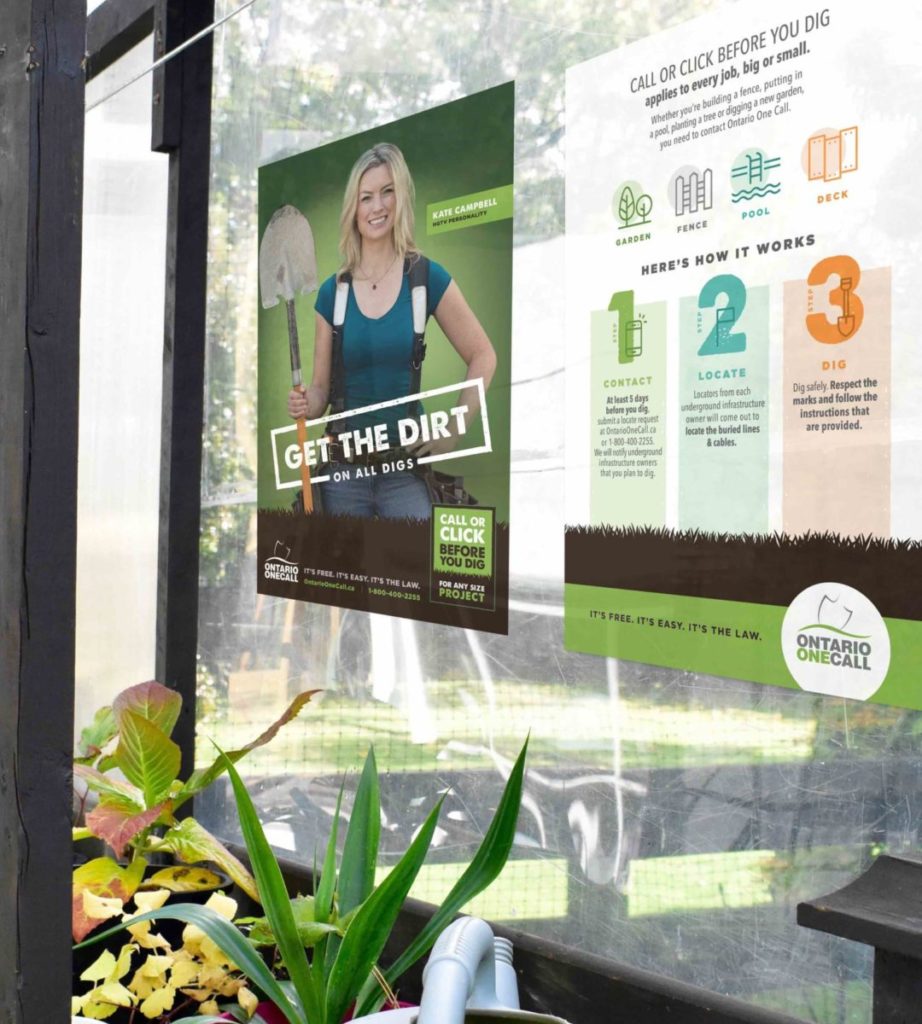
Homeowners need to understand the importance of safe digging practices for any size project. From planting trees to building new vegetable gardens, if you are breaking ground for any reason you must contact Ontario One Call by phoning or going online to request a locate. It’s a free service that keeps your family safe, but it’s also the law!
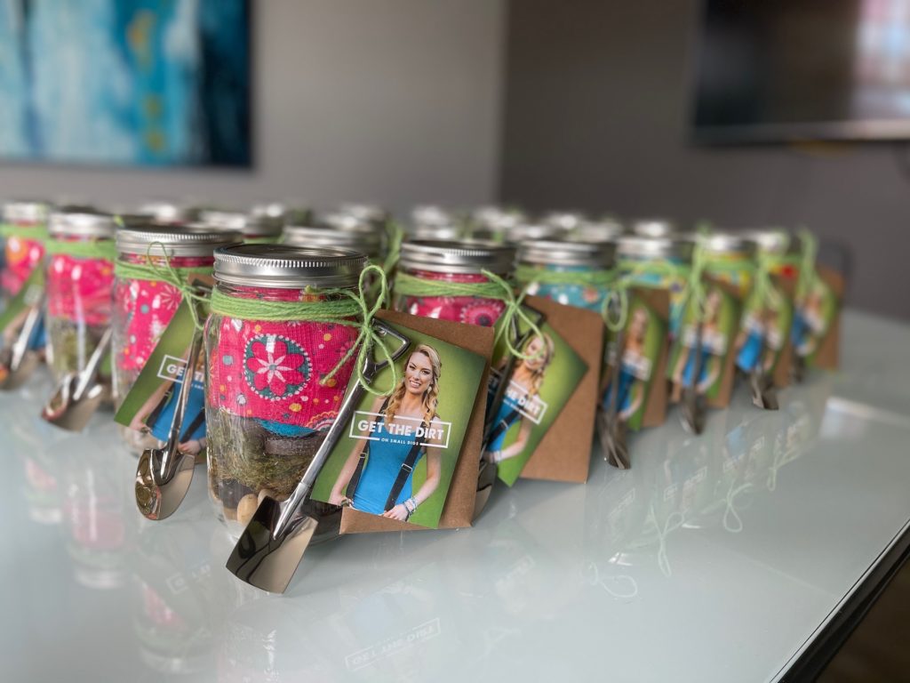
Since most homeowners think that you only need get locates for larger projects such as decks or pools, we needed to create awareness around “calling or clicking” before you dig for ANY size project. This inspired the “Get The Dirt on Small Digs” campaign to bring awareness to smaller-sized projects such as planting a new vegetable garden, digging a hole for a tree, or adding a mailbox to your property. These small projects still require locates and can often be overlooked.
The campaign consisted of traditional and digital tactics. We partnered with HGTV personality and contractor, Kate Campbell, who joined the team as our brand ambassador to build awareness and share the importance of safe digging. A true professional, Kate is an advocate for proper planning and project safety. As an industry professional and leader in outdoor projects, she is well versed on locate requirements and compliance.
Our approach included Kate at the helm of an online influencer campaign to inform the public about safe digging practices in Ontario. We also focused on garden nurseries across the province to capture the smaller digging projects. Posters, flyers, and point-of-sale materials were shipped to nurseries for distribution to homeowners. The print materials featured Kate as our brand advocate to raise the profile of the Ontario One Call brand. Combined with a comprehensive digital marketing strategy, our “Get The Dirt” integrated campaign brought great visibility to this safety concern.
Audioscan “Verifit 2 S-REM Print Ad” Campaign
Category: Advertising: Magazine AD (Campaign)
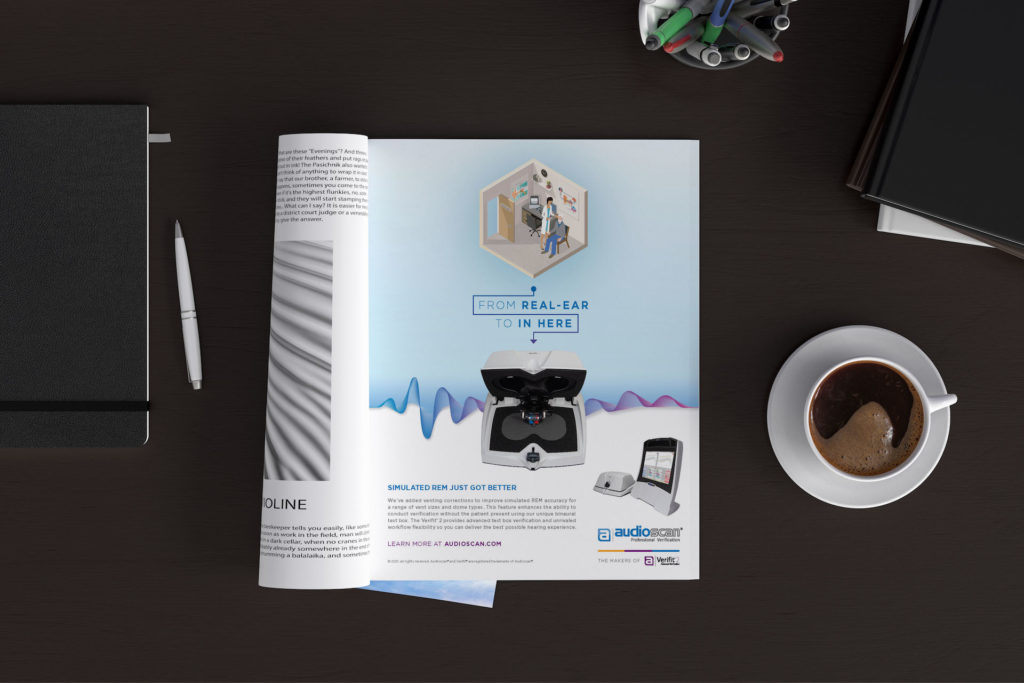
As leaders in hearing aid verification and real ear measurement (REM), Audioscan’s Verifit2 has helped audiologists provide their patients with the best possible hearing experience for decades. REM is a process in which a hearing aid is fitted to a patient based on the unique shape of their ear canal combined with their specific type of hearing loss. This process is considered to be the gold standard in hearing aid verification.
Traditionally REM has required in-clinic patient visits, but recent challenges associated with the COVID-19 pandemic left audiologists across the world searching for innovative ways to reduce patient contact without compromising the accuracy of hearing aid fittings. To meet the increasing demand for reduced patient contact, Audioscan developed and launched new software for their Verifit2, allowing users to conduct real ear measurements in a simulated environment (S-REM). This new software upgrade enabled users to simulate REM through estimated on-ear venting corrections for measurements made in the Verifit2 test box. The creative insight was inspired by the test box itself. Patients no longer needed to go to the audiologist’s office to complete ear measurements – from this box (on-ear measurements in office) to that box (measurements conducted inside the test box).
The visual was created in a minimalist isometric style to illustrate the boxy nature of an office setting to contrast against the actual text box. The campaign incorporated the brand’s new look and feel, utilizing a clean white background with purple soundwaves. The Verifit2 S-REM capabilities provide audiologists with a powerful tool that transforms workflow flexibility, and ultimately, the way they do business.
Amazing! We’re so thankful to all of the clients that allow us to go the extra creative mile! Looking to collaborate on some award-winning ideas? Contact us today to start brainstorming.