
For this week’s Breakfast Club, Nik, our Senior Art Director, discussed upcoming trends for 2016. Although he didn’t tell us which fashion boots would be hot this year, he did talk about what trends are in store for us in graphic design.
At adHOME, graphic design is an important part of what we do. Ensuring print, website, and any other marketing materials are visually appealing can be vital to the success of campaigns. Our design team works to create congruous and beautiful themes for these campaigns and sometimes being on top of the latest trends can assist in flawless execution.
So without further ado here are this year’s top trends.
1. Modern Retro
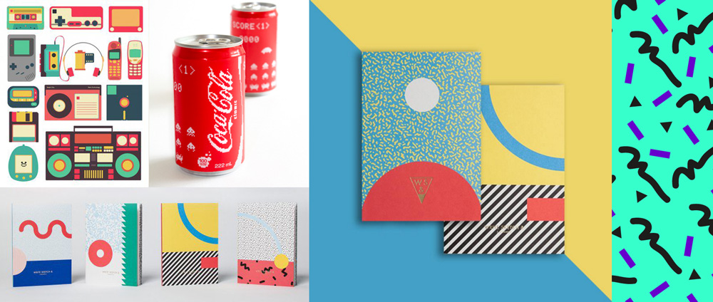
This one is pervasive throughout this year’s trends; some might cheer and others may groan, but the 80s are back, along with the late 70s and early 90s. Things like pixel art represent early video games and computers, as well as space themes, the Walkman and floppy disks.
2. Material Design
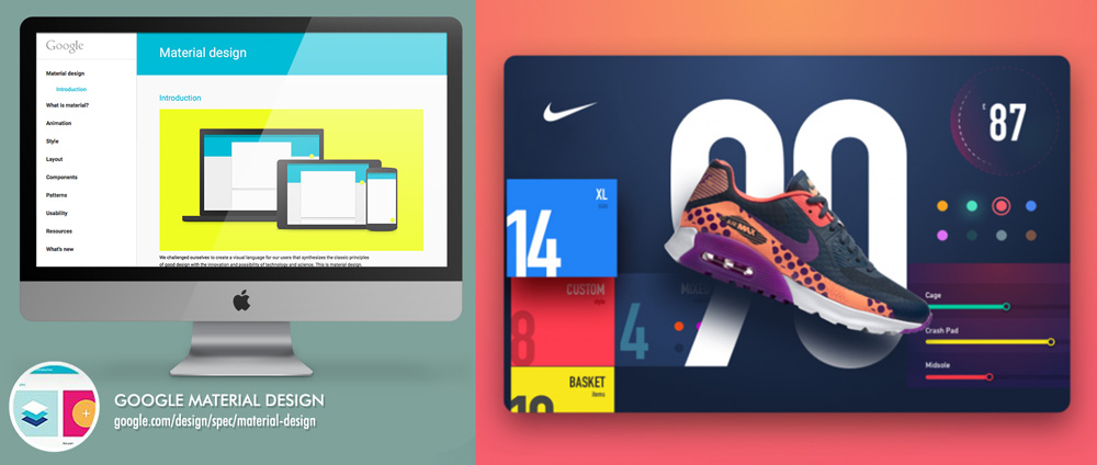
This is a return of last year’s flat design, known as Flat 2.0, but with a twist. Flat design, as we mentioned in last year’s blog post, keeps everything in the same dimension, but this year, that’s changed to add notes of depth to otherwise flat elements.
3. Modular Layouts
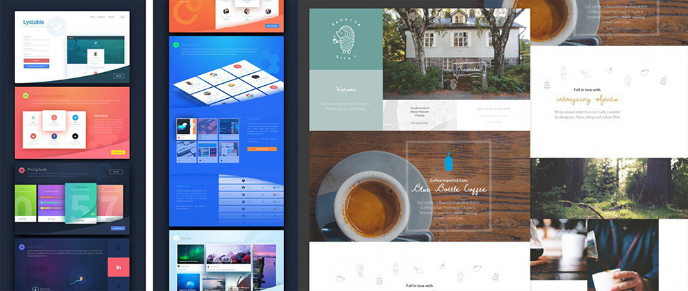
Modular or card-based layouts have been adopted by some of the biggest brands for their websites and mobile apps. Cutting the site up into a grid and then fitting images and blocks together is very utile when it comes to optimizing for both desktop and mobile, and it doesn’t mean that every block has to be the same as the others.
4. Clever Menus
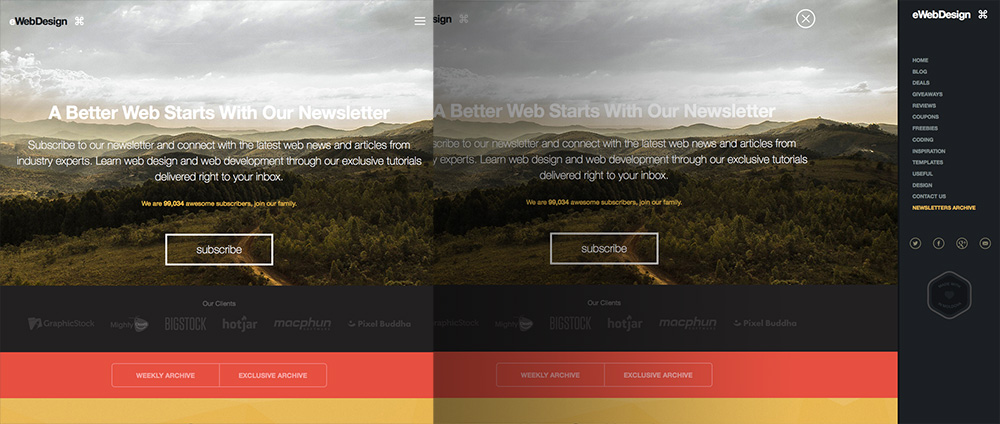
These menus remain hidden until you need them in order to keep from distracting you from the content you want. They eliminate the need for a clunky menu across the top of the screen, but allow all content to be present and easily accessible.
5. Bright Bold Colours
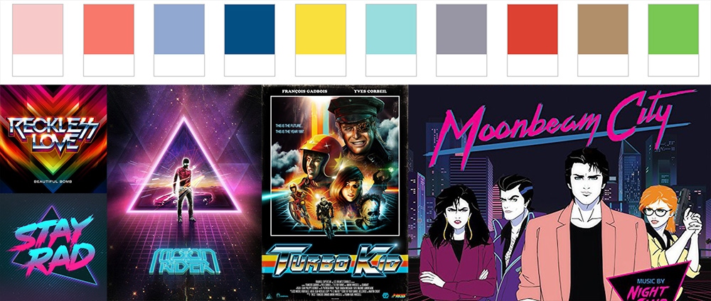
Very 80s once again, big and bright colours are in. This trend also works well with material design. These colours include bright pastels, neons and richer, more saturated tones. The examples above are real and current posters and materials. Pantone’s Spring 2016 Colour Report falls right in line with this prediction.
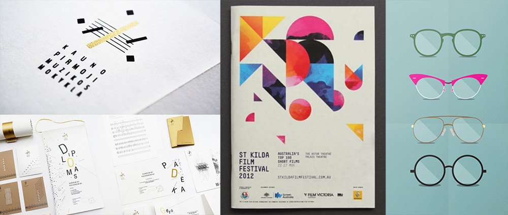
6. Geometric Shapes
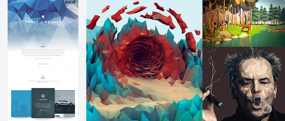
Geometric shapes and patterns are another bold choice for this year that can add uniformity to chaos and create something unique and eye-catching, using those colours we mentioned earlier.
7. Negative Space
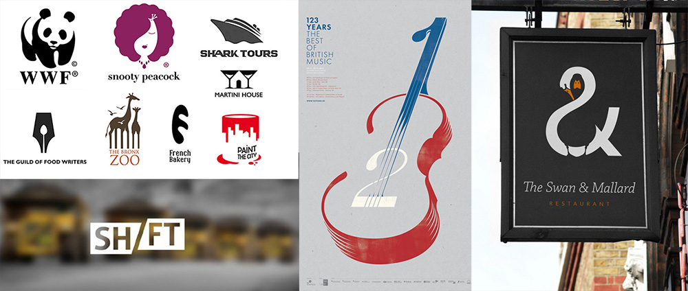
This one is interesting because it’s part of every good design but it can also be used to make intriguing logos with double meanings—one in the dark space and one in the white space, as seen in some of the examples or it can simply help give your composition a more minimal look.
8. Dramatic Typography
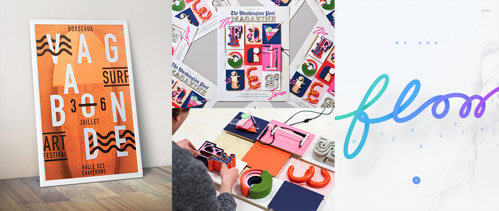
This one speaks for itself, mostly because its typography is beautiful. Big, bold type that’s the centre of attention is stealing the show. One of the cool techniques, among Nik’s favourites, involves physically building the text and then capturing images of it to put into your materials.
9. Custom Illustrations
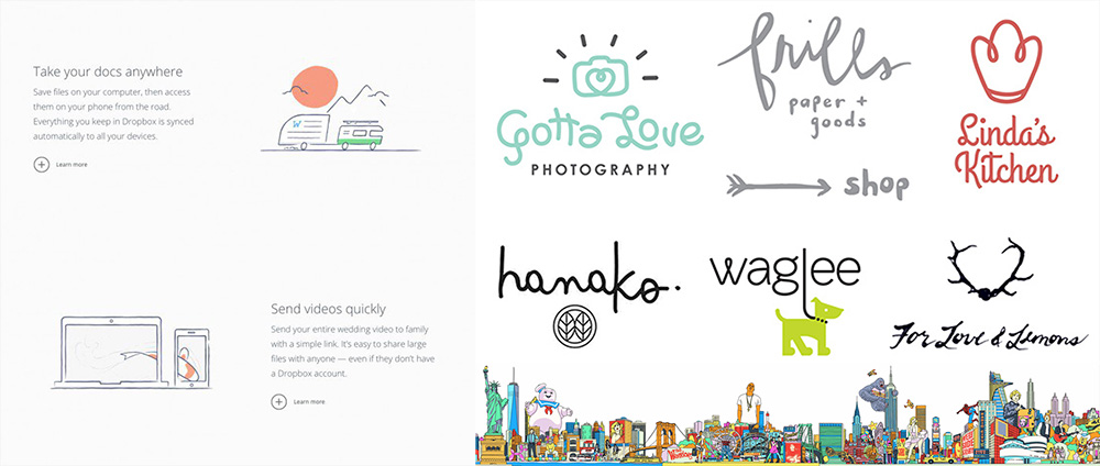
To create a truly unique brand image, designers are putting in the extra work to make something that can’t be found anywhere else. Things like hand-designed fonts and drawn illustrations define this trend.
10. Minimalistic Style
If you love simplicity, this trend is for you. In contrast to the bold 80s styles, this one takes recognizable forms and distorts them or just uses minimalistic elements.
11. Kinetic Logos
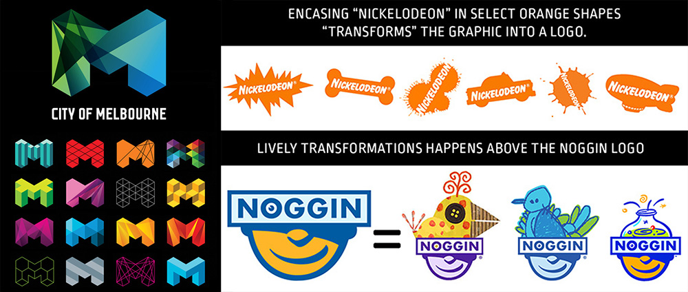
Kinetic logos are those that, while maintaining certain elements, change others. By doing this, the company demonstrates the diversity of what they offer, while also allowing the logo to be more personal for different users.
12. Letter Stacking
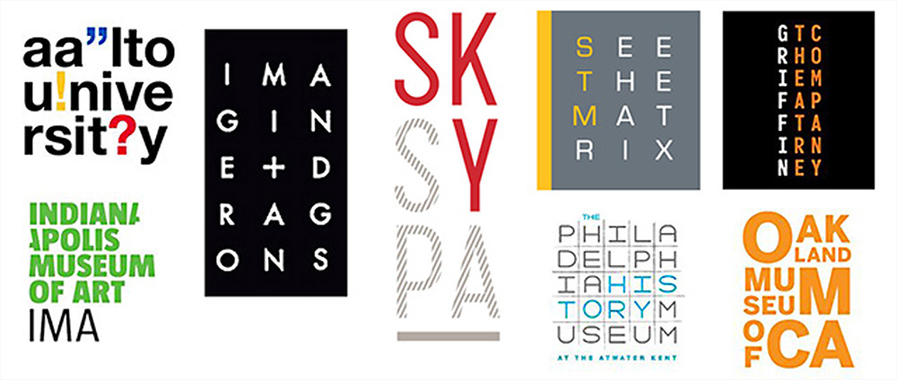
Not exactly a brand new trend, letter stacking allows for longer text in things like logos for those companies with longer names. This text is fitted into a smaller area and it can draw the focus of its audience as they try to decode the text.