
After a long meeting with the Creative Team, where we carefully deliberated between a few nearly identical shades of blue to get the colour just right for our client, this scene from The Devil Wears Prada playfully reminds us of how important the role colour can play in the creative process.
So we ask ourselves…what exactly is colour and why is it so important for brand image?
What Is Colour
At its core, all colour is a product of light and the way light rays hit an object and reflect back into our eye, as our eyes only see the colours that are bounced off or reflected back at us from the object we’re looking at.
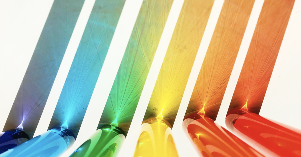
Though we can’t see, the sun’s rays contain all the colours of the rainbow mixed together. This mixture is known as white light and when white light strikes a white surface, it appears white to our eye because the surface absorbs no colour and reflects all colour equally.
Whereas for black, on the other hand, absorbs all colours equally and reflects none back, so it looks black to our eye.
Fun fact: while we often label black as a colour, scientifically it is actually the absence of colour.
On a more colourful note, all colour is a product of light and the way it is reflected back into our eye. But how does this work? Light is made of electromagnetic waves of varying “lengths”, these waves spread out from any light source, such as the sun, lamps, screens, etc. (at 186,000 miles or 300,000 kilometers per second) and depending on the length of the wave and how they hit our eye dictates the colour we will see.
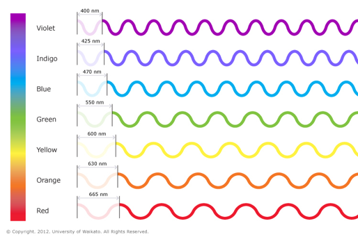
Light waves, like waves in water, can be described by the distance between two successive peaks of the wave – a length known as the wavelength. Different wavelengths of light appear to our eyes as different colours. Shorter wavelengths appear blue or violet, and longer wavelengths appear red.
Ok, so how exactly is our eye perceiving colour.
How The Eyes Perceives Colour
The human eye has two types of light receptors, rods and cones.
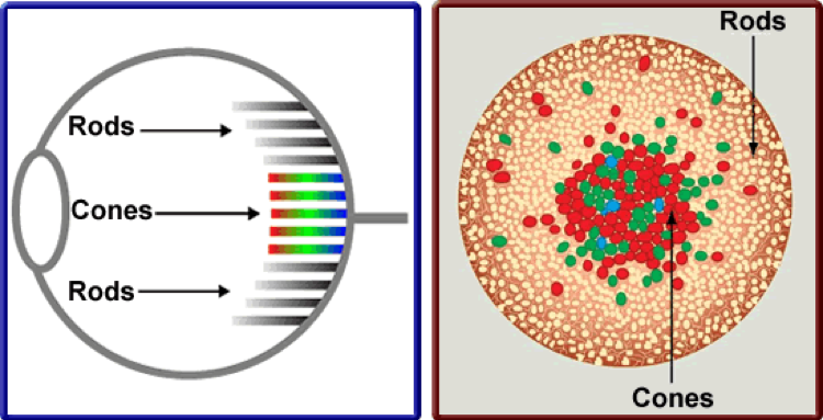
Rods are what help us see in low light level (scotopic vision) but do not actually mediate colour vision. While Cones, on the other hand, are active at higher light levels (photopic vision) and are the part of the eye that helps us to perceive colour.
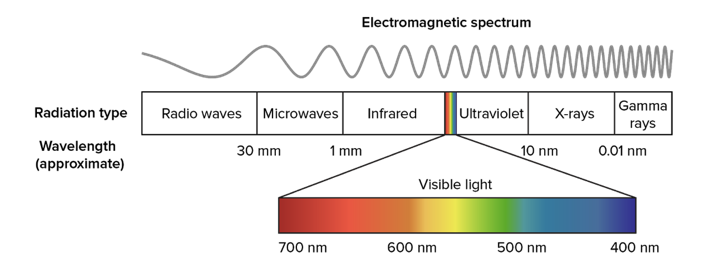 When you look at the whole electromagnetic spectrum, what humans can actually perceive is only a tiny piece of what’s out there. Because human eyes are trichromatic, which means they only contain 3 photoreceptive cones (red, green and blue) we can only see a short piece of the spectrum.
You can check out this TED-Ed to get a better idea of how that works within our brain.
Fun Fact: the mantis shrimp has 12-16 colour-receptive cones and can see into the ultraviolet range.
World of Design and Colour
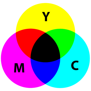
So, now that we know how sight works let’s look at how colour affects the world of design through Subtractive and Additive Colours.
A few weeks ago, the social team had asked the creative studio to provide them with some Graphic Design trivia questions for our Instagram Stories Trivia Tuesday, and one of the questions we came up with was “which two colours make yellow in RGB colour space?”
The answer is, Yellow… which probably flies in the face of everything you’ve been taught in traditional art classes. Let’s take a closer look at how this works.
Subtractive Colour (Left)
Subtractive colour is what you’re using when you mix paint in art class. Subtractive colour mixing means that one begins with white and ends with black; as more colours are added, the result gets darker and darker. This is the process when used when printing.
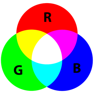
Additive Colour (Right)
When working in a digital space, like on a computer, the colours we see on the screen are created with light using the additive colour method. Additive colour mixing begins with black and ends with white; as more colour is added, the result gets lighter and lighter. This goes back to how humans perceive colour, when all colours of the spectrum are present it appears to us as white light.
As designers, we have to bridge the gap between these 2 colour systems – the colour created in the additive colour system on screen and the subtractive system when inks are mixed in the printing process. When developing brand colours, it’s important to test what the colour on screen will look like printed, in case there is a different RGB and CMYK colour code needed to maintain the integrity of the true brand colour.
To further help with brand cohesiveness, Pantone colours (or spot colours) are also used to get the same colour every time.
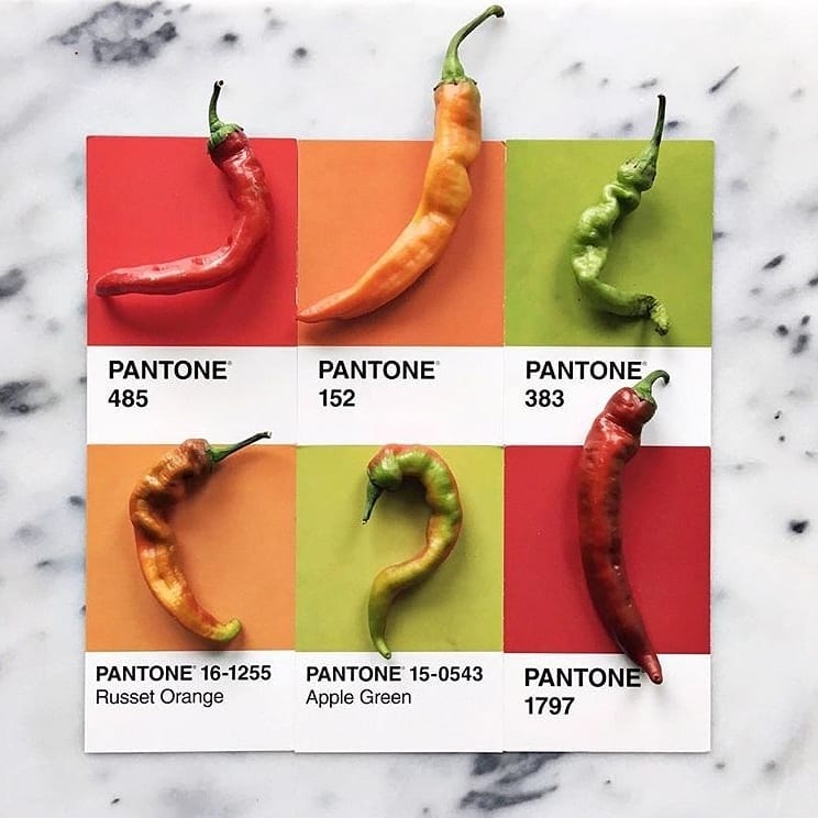
While most printing uses CMYK (Cyan, Magenta, Yellow and blacK) mixing during the printing process –which could result in discrepancies in colour depending on the printer, the ink mixture etc.– a Pantone colour is one ink specifically mixed for recurring jobs/projects that help get the colour the same every single time. This allows for a large brand, like Coca-Cola, to have the same appearance on every can in every country.
Mixing a Pantone colour can be a time and life-saver.
Evoking Emotion
Regardless of what we’re working on in the creative studio, though, the one thing that must be taken into consideration is tone, “What emotion do I want this creative to evoke?”
Colour plays a huge role in this decision as warm colours can evoke different emotions than cool colours, while bright colours can create a different feeling than muted colours.
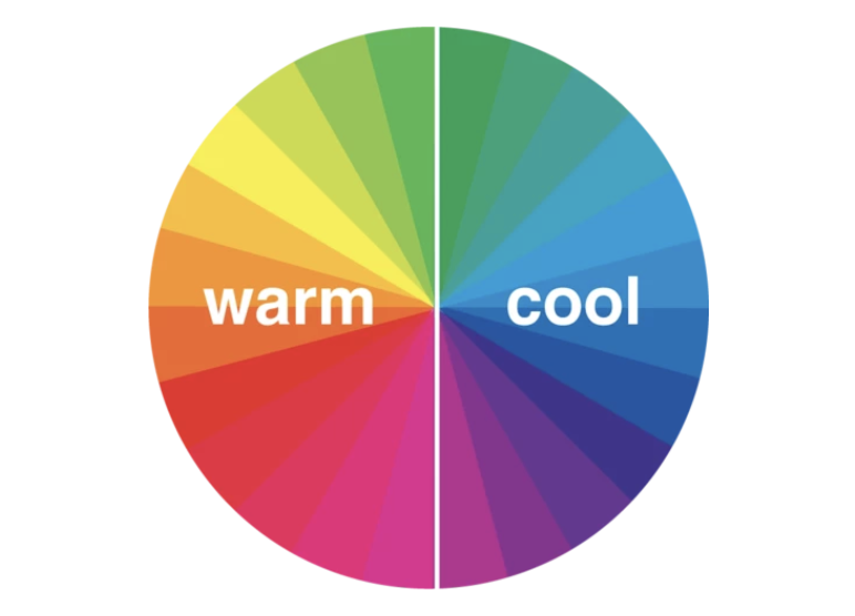 For example, warm colours–like red, orange and yellow–often evoke feelings of happiness, love, optimism and energy. However, these colours are also often used to alert people of (like in stop signs and hazard warnings).
Cool colours, on the other hand, can be used to express health (green) or evoke calm (purples) and even express sadness (blue) If a company wants to display health, beauty or security, incorporate these colours.
Fun fact: Red can also increase a person’s appetite.
Colouring In Your Brand
Colour isn’t just an important aspect of how a creative may appeal to an audience, it also plays a huge role in brand identity itself. Some of the most iconic brands have made lasting impressions with their audiences by associating their name/business/product with a carefully and specifically chosen colour or set of colours (which are also often connected to a certain emotion they want their brand to portray.)
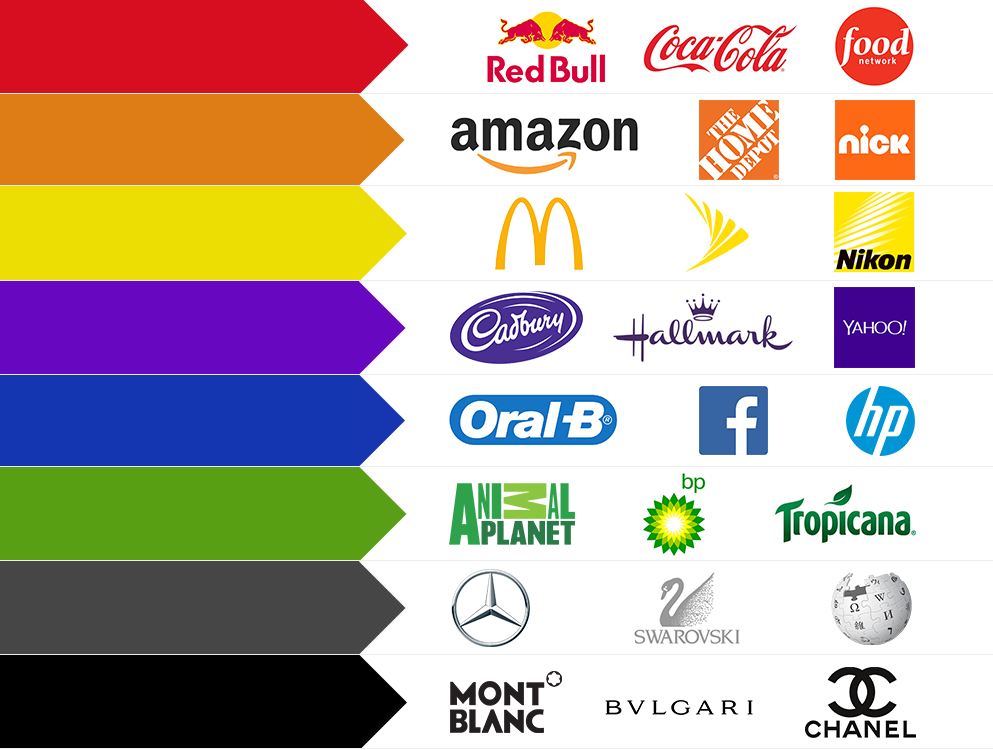
When you look at these colours on the left, are there any brands that come to mind that are not labelled on the right? Let us know in the comments below!
So, as you can see, there is a reason the creative studio took the amount of time it did carefully choosing between “identical” blues to get that perfect shade for our client. It’s because we understand the impact colour can have on your brand image, and we take that pretty darn seriously.