These days there are endless opportunities and media platforms for brands to connect with consumers. You can find ads on TV, on the internet, and now they even come right to us on our cell phones – in our social media feeds, our chats, and even our games. Companies everywhere are competing for consumer attention, they’re practically screaming over top of one another trying to stand out. The end result, much like the cracker aisle at the grocery store, can be very overwhelming. Enter minimalism…
By now, you’ve probably heard of minimalism. It’s the idea of reducing the number “things” you have in your life and replacing them with what really matters. But this concept doesn’t just apply to cleaning out your closets, it applies to your company’s brand as well.
The motto of minimalism is “omit needless things.” In the advertising world this means having clear, concise messaging and clean, simple design. This has never been so important as it is today. With the majority of ads and websites being viewed on smart phone screens, load time is of the essence – we have to focus on the key points that the customer will find most valuable. Goodbye flashy design and flowery prose, it’s time to get straight to the point without losing a single important detail.
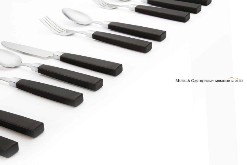
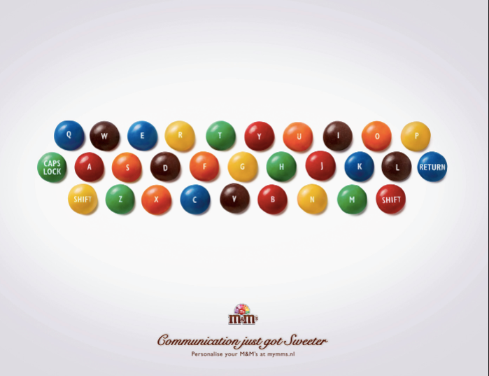
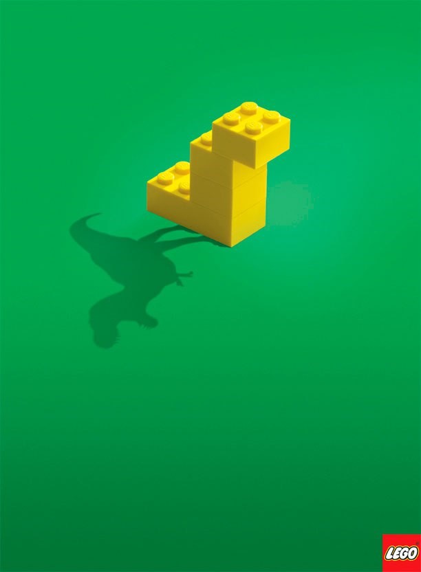
When writing and designing, it’s always tempting to keep adding details, but this bare-bones approach really lets the design teams flex their creative muscles. By stripping down copy, and focusing on contrast, space, and beautiful typography, we’re able to effectively convey a strong message to viewers that, in a louder more cluttered ad, would be lost.
“Less is more” – sounds simple, right? You may be surprised. Coming up with design that’s simple and easy to understand, while also creatively using negative space to draw attention to the key messaging can definitely be a challenge, but you can see from these amazing design examples that the end results are well worth the effort.