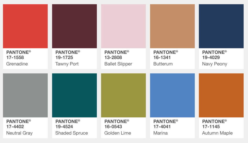
As a team of people who are creative for a living, we inevitably take inspiration from everyday life and channel it into our work. This includes the changing of the seasons. It could be anything from the bright warm colour palette of the fall trees, to the cozy feeling of a large knit sweater or the heat of a steaming mug of coffee on cold fingers. Every season, the team at the Pantone Color Institute evaluates the colours shown by fashion designers at New York’s Fashion Week to create a palette of popular colours. This year’s fall colours include traditional warm hues offset with cool jewel tones and pops of bright colour.
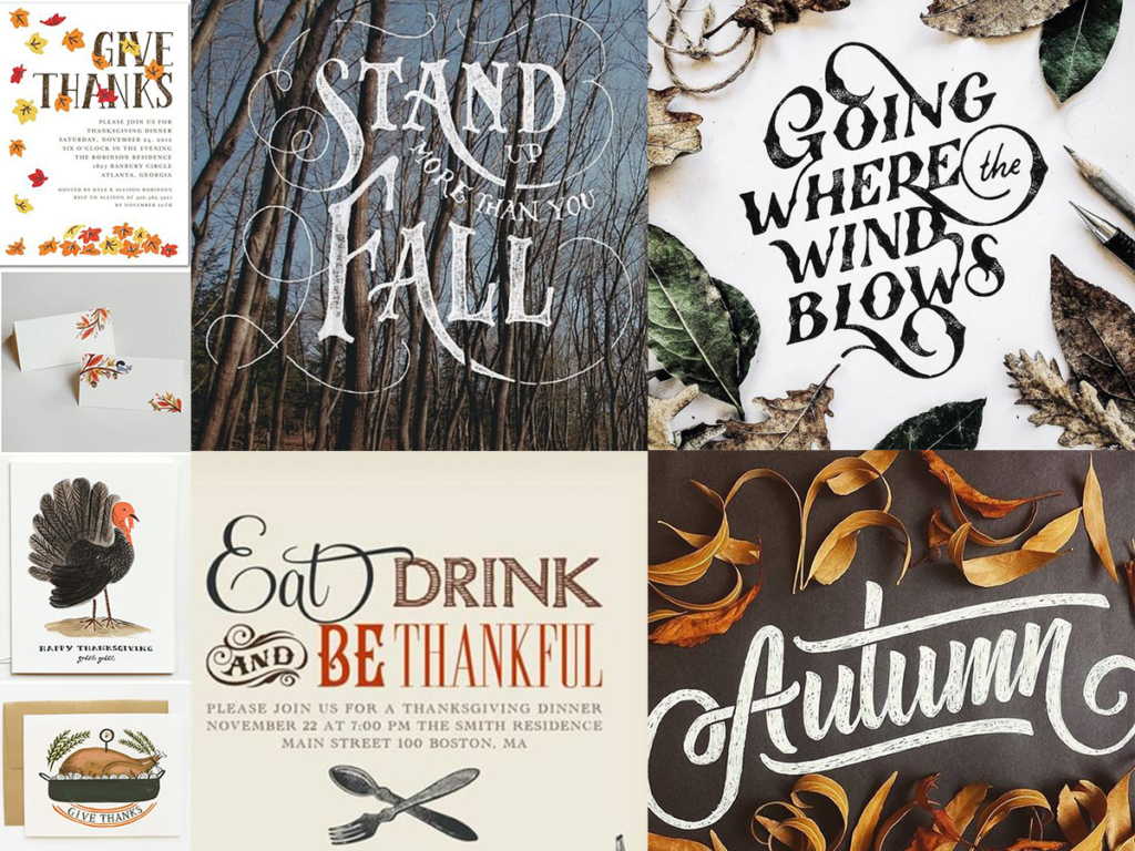
Typography and illustration has also been inspired by the fall harvest as manifested in earthy, simple and rustic styles. In an increasingly mechanized and technological world, people are craving traditional craft and things that show the imperfections that you don’t necessarily see in mass-produced items.
Hand Lettering:
Gives a homey, handmade and personal feeling. We are loving the intertwined display style type (like custom chalkboard messaging) or a simple handwritten script, such as Jane Austen.
Bold Textured Letters:
Used on either a script or straight font, breaks up the mechanical nature of computer type, once again harkens to a handmade feel.
Illustrations that are simple, look hand-drawn or painted, combine vintage-esque line work with simpler colour block painting to make our hearts melt this season.
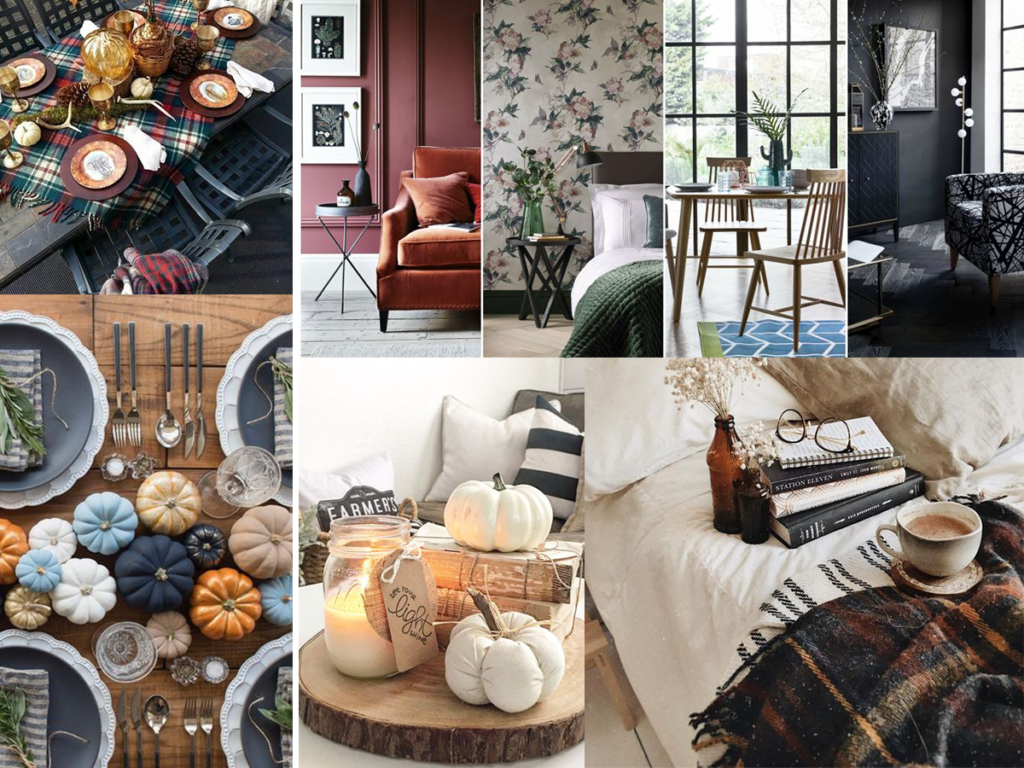
Looking to other fields of design for influences of the season, we can’t forget interior design. The presence of some of our favourite colours, geometric shapes, bold jewel tones, big patterns and monochromatic colour schemes all are trends this season. A new trend that is emerging is “Back to Nature” with a focus on rustic elements: rough wood, vintage metal elements, and neutral tones to offset bright pops of colour.